
In what ways does your media production use, develop or challenge forms & conventions of real media products ?
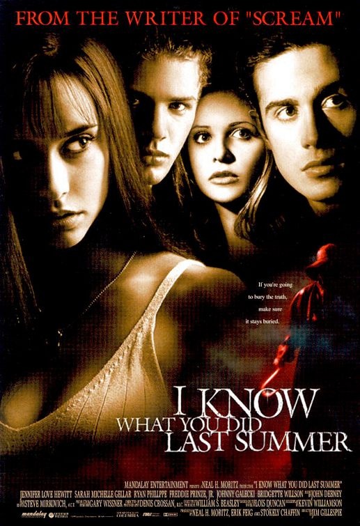
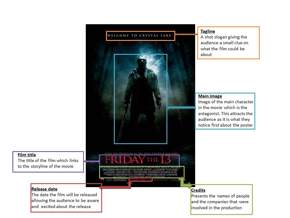
Question 1 is about the conventions that we chose to follow, challenge, and develop. By using the common conventions of slasher we was able to produce the horror products that we wanted. Looking at styles, framing and other elements of existing horror products, we wanted to our final products to be original but also not making sure that we obtained the styles and features of the slasher genre and most importantly following and developing conventions. For example a lot of slasher posters use the antagonist as the main image on the poster.
CONVENTIONS
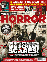
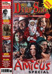
Conventions are essentially rules followed to make the product recognisable to the audience. An example of media products is that on horror posters, they include credits, quotes and the release date. A magazine would also include a bar code, a selling line and a image that would represent horror. Just as a poster and magazine
POSTER
In order to create our final poster we had to analyse a range of existing horror posters to help us in following key conventions. Whilst creating our final poster we were inspired by existing horror posters, which allowed us to incorporate some of the features and use our creativity to develop our own.
Poster Mise-en-scene
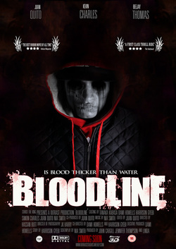
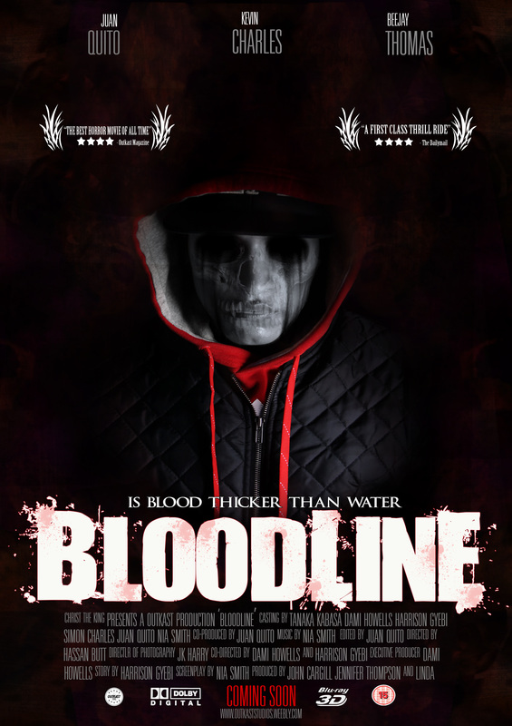
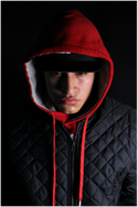
Lighting- The photo was taken under a low key lighting so that it creates a dark mood as it is a horror poster and allowing the image to look scary. The form of lighting also allows the audience to recognise that it is a horror film. We didn't use a high key lighting as it would look too bright which would not convey a horror genre. Especially as it is a slasher.
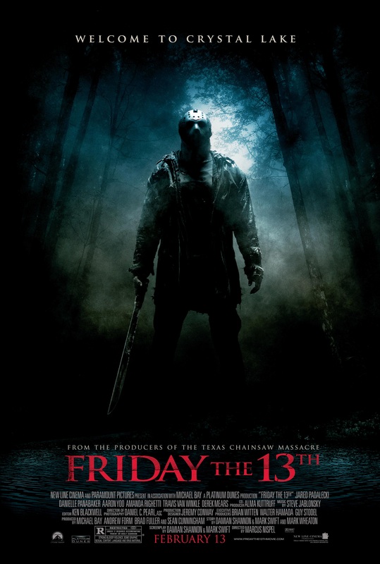
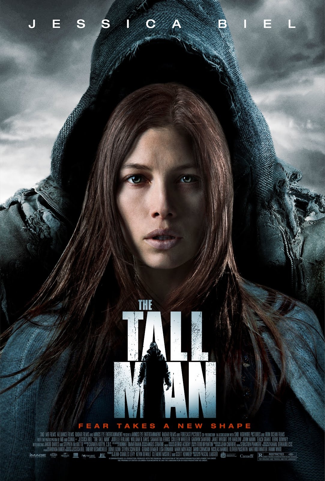
NVC- The NVC of the character is very straight not expressing any emotions, which is seen unwelcoming. This follows the conventions of existing antagonists, for example 'Friday the 13th' the antagonist on the poster has a straight face.
Setting- We took the photos with a black back drop therefore we didnt have a setting. The background is like a smokey red with shots from the trailer inside of it which connotes abit of the story that would make the audience want to watch the film.
Costume- The Antagonist is wearing a black jacket and a red hoodie which connotes danger. It is also used to hide his identity.
Lighting- The photo was taken under a low key lighting so that it creates a dark mood as it is a horror poster and allowing the image to look scary. The form of lighting also allows the audience to recognise that it is a horror film. We didn't use a high key lighting as it would look too bright which would not convey a horror genre. Especially as it is a slasher.
NVC- The NVC of the character is very straight not expressing any emotions, which is seen unwelcoming. This follows the conventions of existing antagonists, for example 'Friday the 13th' the antagonist on the poster has a straight face.
Setting- We took the photos with a black back drop therefore we didnt have a setting. The background is like a smokey red with shots from the trailer inside of it which connotes abit of the story that would make the audience want to watch the film.
Costume- The Antagonist is wearing a black jacket and a red hoodie which connotes danger. It is also used to hide his identity.
|

|
|
|
|
|
|
|
Incorporating features from different posters and putting them together, allowed us to create a successful horror poster. To compare the features on our poster and features of the ones of an existing horror poster we have broken down our poster to put forward the conventions that were followed, challenged and developed. By doing this it allows us to make sure that we understand the concepts of the slasher genre when it comes to producing a horror poster.
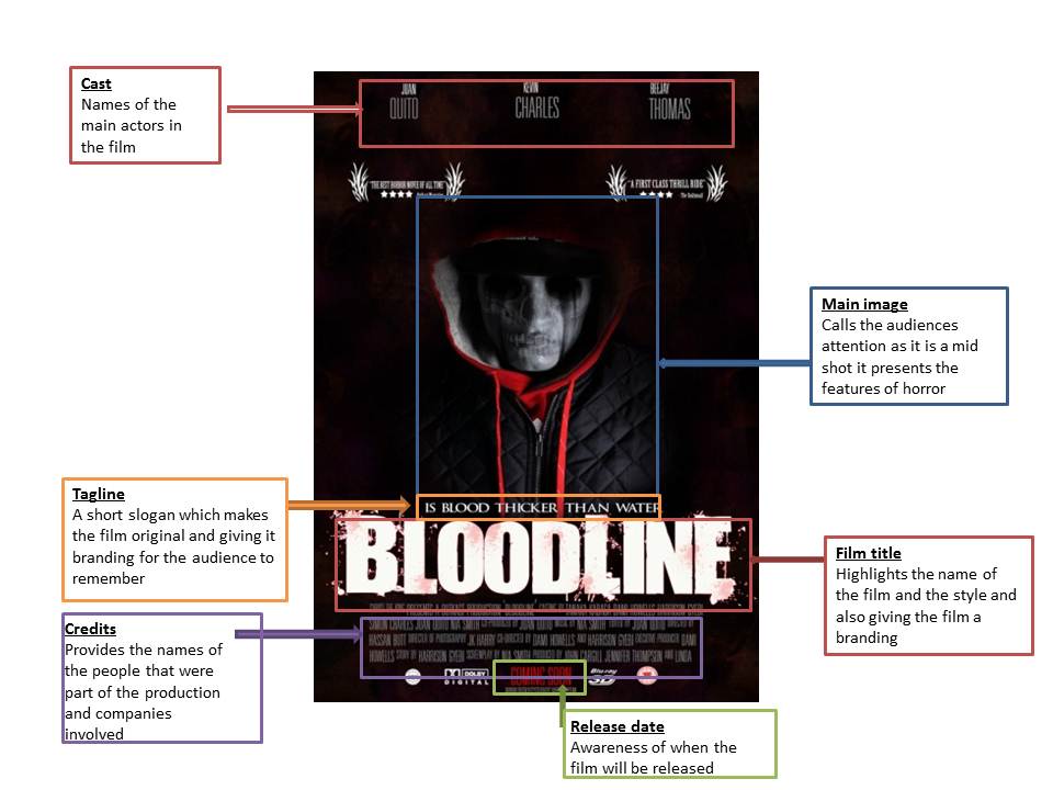
The convention we followed was having the film title centered on the poster. We chose to follow this convention as it fitted with the style and image, allowing the image and title be the centre of focus. This attracts the audience attention and makes them want to know more about the film.
|
Another convention which was followed was having the antagonist as the main image on the poster. We followed this convention as many existing horror posters use their antagonist as the main image on the poster. This is done so that the audience recognise that the genre of the film would be horror and for them to also recognise that character in the image is the one who will be killing people in the film. We also decided that me would use a medium close up shot of the antagonist on the poster as it allows the audience to see the details we had created on the antagonists face. This convention was followed as many successful existing slasher posters have done the same, which makes this effective.
|


An important convention that was the use of a ‘Tagline’ which a lot of existing horror poster use to give a slight insight of what the film would be about or what it is based on . Our tagline for the poster is ‘Is Blood Thicker Than Water’ this is short so that we don’t give away too much about the film. As it is short it allows the audiences interpret it the way they want and questioning what the film could possibly be about, therefore persuading them to want to watch he film. The tagline was placed above the film title making it visible and easy to read.
|

The colour schemes for our poster are Black, Red, White and Grey. Black and Red can be seen as colours of danger. They are also typical colours used in most horror posters especially in the slasher genre. The use of these dark colours is used to create a kind of scary effect and a sense of hidden identity. These colours make it clear to the audience that the poster is a horror poster. Aside from these dark danger colours we incorporated white and grey to develop this convention even more allowing our poster to look original and allowing the fonts t stand out from the dark background we already have.
|


The convention of having film logos on the poster was followed. The logos are placed at the bottom of the poster as it isn’t we really the audience to focus on, although it is a very important element to have on a movie poster. This is because it presents the film companies that were involved in the process of the making, also including our production website to find out more about the film and other areas
|
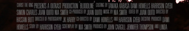
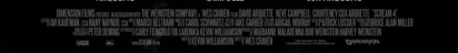
Another essential convention we followed was placing the credits at the bottom of the poster, which is what is done by all existing horror posters. A lot of horror movie posters use ‘skinny’ fonts to write their credits on the poster which is a convention that we had also followed. The credits include casts, directors, writer, producers, designers and the sound technician. The credits are quiet small as it isn’t the main focus of the poster. Most of the time the credits are written in: grey, black or white. We decided to use grey so that it stands out from the background
|
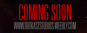

As our poster is just a teaser there is no set date to when the film will be released hence the reason why we use the phrase “Coming soon” to indicate the release date is not yet confirmed. This a convention followed as many teaser movie posters use the phrase “Coming Soon”. The convention followed was also having it placed at the bottom of the poster as many existing movie posters do. We decided to use the same font as the credits to create a sense of continuity and also not to have a lot of fonts which would make the poster look cheap and unprofessional.
Overall, I believe that we have followed the conventions to creating a successful horror poster. We made sure that we included all the elements of horror poster, in order for our audience to recognise what kind of film is being produced. Elements such as adding details to face of the antagonist to make him look scary and deciding to use the details of a skull which represents death. We also made sure that everything was positioned in the correct place and neatly in order to make sure that the poster has a professional look to it and not to look cheap which would make it unsuccessful.
MAGAZINE
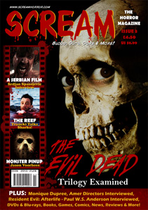
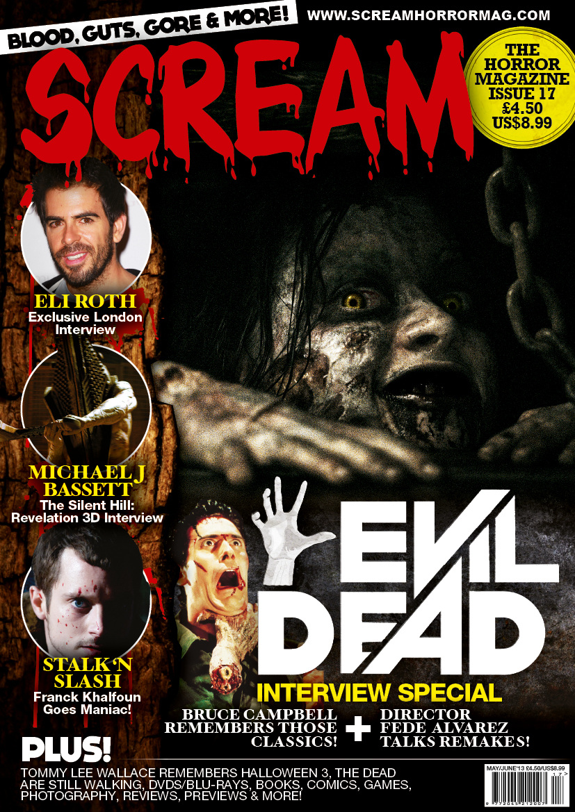
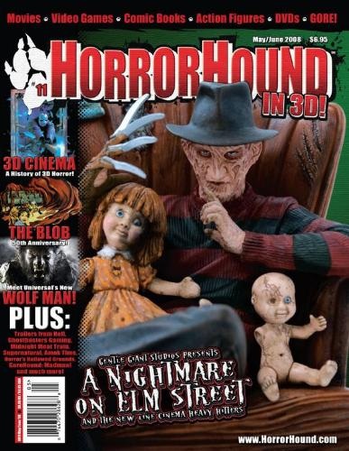
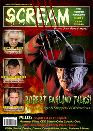
Just as we had to look at existing posters to help us create our final poster, we had to do the same for our magazine, this was to keep the consistency in horror magazines. We were inspired by a few horror magazines, which gave us ides on how we should create our own and incorporating some features and developing it into our final piece.
Magazine mise-en-scene
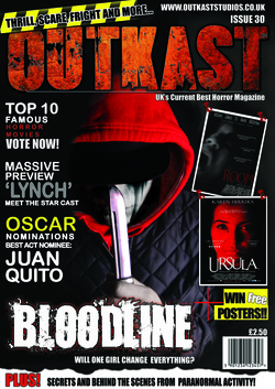
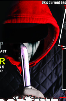
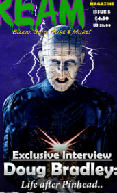
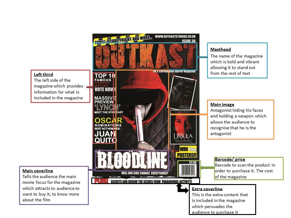
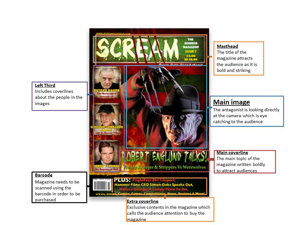
Lighting- The lighting is a low key lighting as it allows all the conventions such as coverlines, masthead, images on the magazine to stand out and also creates that scary element to it.
NVC- The NVC of the antagonist is like an unknown identity as the antagonist is putting his head down and allowing his has to cover his eyes.
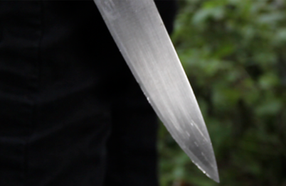
Prop- The antagonist is holding a knife which is used as a prop. This allows the audience to know that it is a horror film also allowing them to know that the antagonist uses the knife to kill his victims.
Costume- The antagonist is wearing a black jacket, a red hoodie and a black hat which reflects on how he is. From this we can see an unknown character and someone trying to hide their identity which is what the black hat does. The colours of the costume also have a link with the colour scheme of the magazine, grabbing the audiences attention.
Setting- We don't have an exact setting but a black back drop is used instead to create a dark atmosphere and focus on the main image and other conventions of the magazine.
Lighting- The lighting is a low key lighting as it allows all the conventions such as coverlines, masthead, images on the magazine to stand out and also creates that scary element to it.
NVC- The NVC of the antagonist is like an unknown identity as the antagonist is putting his head down and allowing his has to cover his eyes.
Prop- The antagonist is holding a knife which is used as a prop. This allows the audience to know that it is a horror film also allowing them to know that the antagonist uses the knife to kill his victims.
Costume- The antagonist is wearing a black jacket, a red hoodie and a black hat which reflects on how he is. From this we can see an unknown character and someone trying to hide their identity which is what the black hat does. The colours of the costume also have a link with the colour scheme of the magazine, grabbing the audiences attention.
Setting- We don't have an exact setting but a black back drop is used instead to create a dark atmosphere and focus on the main image and other conventions of the magazine.
|
|
|
|
|
|
|
|
A very important convention for a magazine that we followed was having a masthead that stood out from everything else on the magazine. We made sure that the masthead was big and bold which allows it to stand out. The masthead stands out because we used a vibrant colour such as orangey colour with a black outline, which is a very distinctive colour allowing it to stand out from the rest. We made sure that we used a bold font. I believe that this font attracts the audience’s attention as it looks different and stylish. We also followed a very common convention of writing the masthead in uppercase also allowing it to stand out.
|
We followed the convention of a left third. Horror magazines left third normally include different features such as advertising other movie posters or even includes brief information of what will revealed in the magazine. For our magazine our left third include brief information on the magazine will feature.
|


This is an extra coverline convention we decided o follow. We followed followed this convention as many magazines use this to persuade the audience to buy the magazine because it usually includes exclusive contents. However it is placed at the bottom of the magazine because it isn't the main focus of the magazine.
|
An important convention followed is the main coverline. The main coverline is the title of the movie that the magazine will be mainly focused on. It is written i a different font compared to the rest of the text on the magazine this is because we have used the font used for the movie poster, this is to ensure a professional look for the magazine and also for it to stand out. The main coverline is placed almost at the bottom of the page this so that it doesn't clash with the masthead as they are both big bold fonts.
|
The main image on the magazine is the antagonist. The antagonist is used as the main image to distinguish the fact that it is a horror magazine. The antagonists face is hidden which makes the audience suspicious about what he looks like. The camera shot is a close up so that the knife in his hand is noticeable.
|
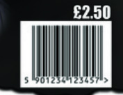
The barcode is included in the magazine to signify that the magazine needs to be scanned in order to be purchased. This allows the magazine to look professional. The barcode also stores the cost of the magazine and allows stores to keep track of how many is being sold. The barcode is small and placed at the bottom of the magazine.
|
By the looks of our magazine, I can say confidently that we have followed the necessary conventions that conforms a successful horror magazine. We have tried to make sure that our magazine looks as professional as possible but us most importantly including features that allows the audience to recognise the genre of the magazine.
TRAILER
To help us with coming up with ideas for our trailer, we watched and analysed various trailers to see what they all consisted of and what they had in common. For example what kind of shots, pacing and storyline they used. After watching these trailers we were inspired by a few of them. Therefore we decided to incorporate parts from each one to produce our own trailer and most importantly making sure that we followed the necessary conventions for t to be a slasher film.
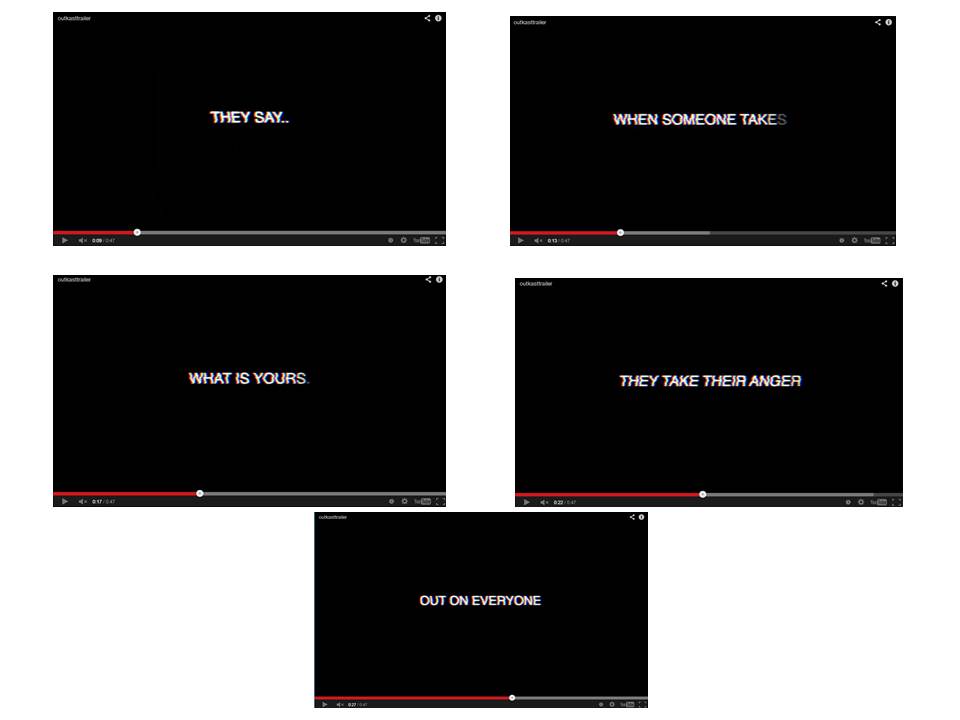
We decided to use captions five for our trailer to give a brief outline f the narrative but also making sure that we don't give away too much. We decided to keep the background of the caption clean so that there wasn't too much going on. As the texts fades in as if its being typed as it goes by. The captions are straight forward and also continues with the same font through out to look professional and so that it has that consistency in it. Most importantly we made sure that the caption made sense and links with what the next shots would be.
|
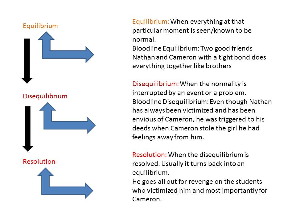
To help us in construction our trailer we followed the Todorovs theory, which includes an Equilibrium, Disequilibrium and a resolution. In other words the beginning, middle and end. Although we followed this structure we didn't exactly incorporate in resolution of a happy ending and going back to the equilibrium in our trailer, as we wanted t make it exiting by ending it with the antagonist in a dark room holding a knife. This then makes the audience eager to know what happens next and want to watch the film.
|
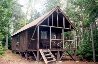
We filmed our trailer at college, providing a education environment because our trailer is mainly based on teenagers. By having a school environment we are challenging the convention of slasher movies being set in a house or like in the woods were there is a remote cabin. Although we challenged this convention were still able to make our trailer look effective by filming in college premises.
|
For our trailer we decided that we would have different paing depending on the shots so that they fit in together. At the beginning we have a slow pace as the antagonist was through the woods. As soon as the montage shots come in the pace starts to get faster. We did this to build the tension and create an excitement. Going from a slow pace to a fast pace really allows the trailer to flow so that it doesnt look messy and unprofessional. We followed this convention as most slasher trailers this type of pacing for their trailers.
|
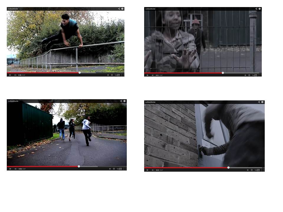
We followed the convention of having montage shots which will creates a form of exitement. These montage shots are shots of where the vitims are running away from the antagonist. Existing trailers also use montage shots make it seem scary.
|


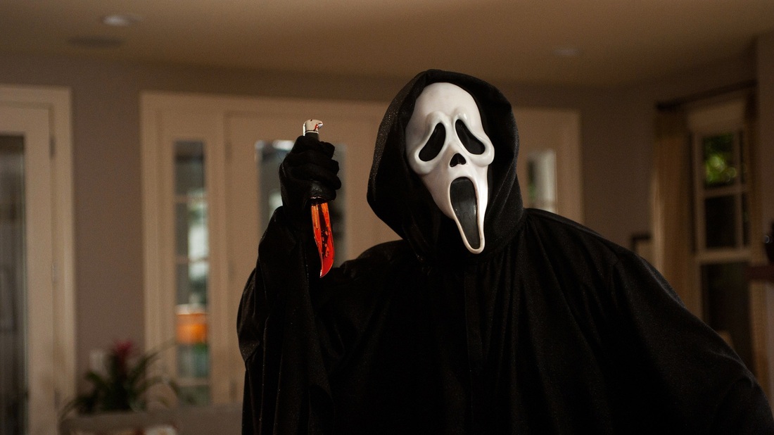
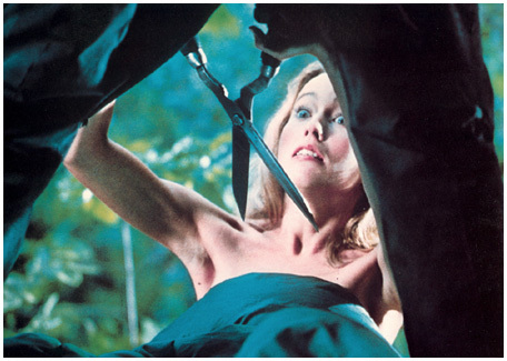
The convention of the antagonist having a weapon was followed. This was because the killer needed something to kill his victims with. This convention is followed by almost all slasher films. Antagonists from different horror movies usually have different types of weapons such as a knife, axe, chainsaw, anything that can be used to kill someone. In our case we used a knife as it is a easy prop to find and it was also an effective weapon to use.
|
We have challenged the convention of the length of movie trailers. A lot of film trailers are usually more than a minute long. With our trailer we decided that we wouldn't have our trailer that long but instead have it shorter than a minute. This was because we didn't want to give away o much of the narrative in the trailer, so that the audience would be more willing to watch the film as they would want to know what happens.
|
We incorporated the convention of having the antagonist sneaking up on the victims. We also developed this convention by having the antagonist standing in front of them instead of from the back. As many horror films the antagonist comes from the back.
|
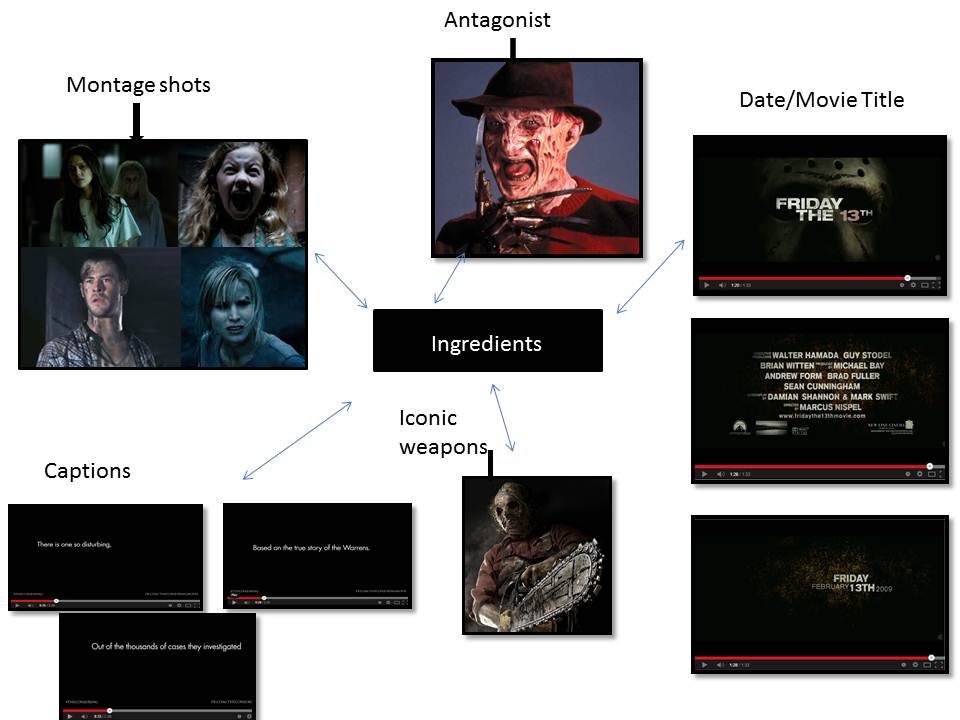
SUB-GENRE - SLASHER
|
|
|
|
|
|
STORYLINE
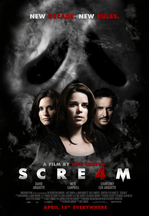
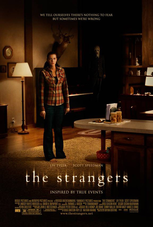
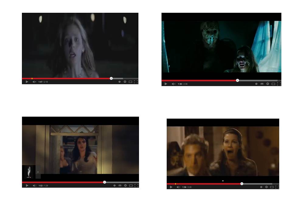
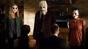
As we chose slasher as our sub-genre. Which involves a killer who is stalking and killing a number of victims often using a cutting tool such as a knife, axe or a chainsaw. Our storyline follows conventions of a slasher movie storyline. As our storyline involves a killer who goes out to kill his victims using a knife as his weapon. This follows the slasher convention as it involves stalking and killing which is used in many slasher movies such as 'The Strangers' were the victims are being stalked and getting killed. The killing of the victims all started because the antagonist was being being bullied and his best mate takes his girl. This something like what happens in the movie 'Scream 4' Jill was the second ghostface behind the killings which was because of the betrayal of her ex-boyfriend.
|
|
|
CHARACTERS
Antagonist:
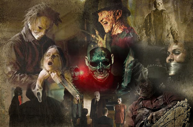
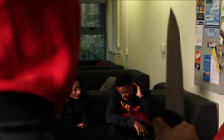
The killer usually wears a type of mask, which could look scary or even just a plain mask; this is just in order to hide the identity of the killer. A lot of the times the killer tends to be a male instead of a female. We had followed the convention of the killer being a male although we challenged the part of the killer wearing mask. Instead we had the killer wear dark clothing with a red hoodie cover his head and a face cap to cover just above his face. We decided to do this because we wanted to give the idea that the killer was someone the victims knew of but at the same time they wouldn’t know he was the one going around killing people. For example when the killer would go to kill his victims, he would make sure they saw his face for the victim to remember what they had done to him, then the killer would kill them in that moment. Most of the time the reason the killer starts to go around killing people, is because of their past or simply because of one person. Our antagonist starts going around killing people is because of kids at college making a mockery out of him but mainly because of his best-friend stealing the girl he likes.
The killer usually wears a type of mask, which could look scary or even just a plain mask; this is just in order to hide the identity of the killer. A lot of the times the killer tends to be a male instead of a female. We had followed the convention of the killer being a male although we challenged the part of the killer wearing mask. Instead we had the killer wear dark clothing with a red hoodie cover his head and a face cap to cover just above his face. We decided to do this because we wanted to give the idea that the killer was someone the victims knew of but at the same time they wouldn’t know he was the one going around killing people. For example when the killer would go to kill his victims, he would make sure they saw his face for the victim to remember what they had done to him, then the killer would kill them in that moment. Most of the time the reason the killer starts to go around killing people, is because of their past or simply because of one person. Our antagonist starts going around killing people is because of kids at college making a mockery out of him but mainly because of his best-friend stealing the girl he likes.
|
|
|
|
Location:
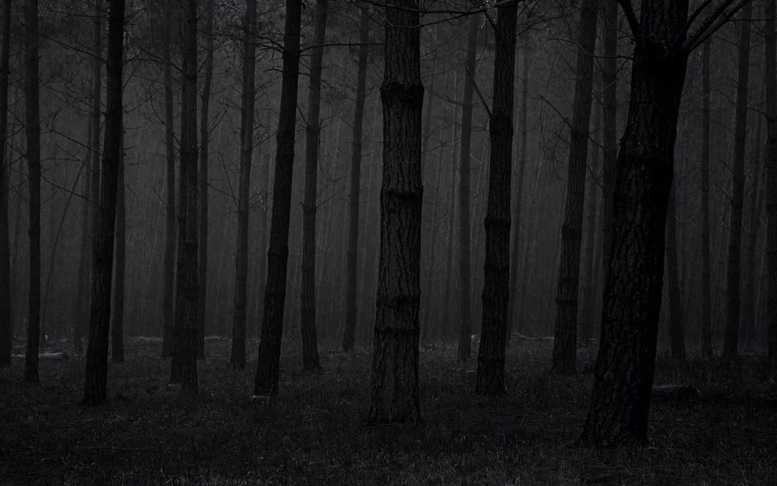
A lot of the times in slasher films the setting of the location I usually something to do with the antagonist, as in it relates to why he does what he does. For example with our trailer is set in the college his is because it is where the antagonist had been bullied. A lot of the times in slasher films the location is usually set in an abandoned place for example in the woods.
A lot of the times in slasher films the setting of the location I usually something to do with the antagonist, as in it relates to why he does what he does. For example with our trailer is set in the college his is because it is where the antagonist had been bullied. A lot of the times in slasher films the location is usually set in an abandoned place for example in the woods.
|
|
|

|
Weapon:
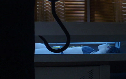
Almost every slasher film, the killer tends to have a very dangerous weapon which he uses to kill people. He uses any weapon that is sharp enough to do the job quickly. These are weapons such as an axe, chainsaw, saw, knife, a hook. There is no specific ones used in every slasher film, they are all different, but different enough to still kill their victims with. In our trailer we used a knife as the killer’s weapon as it was an easy weapon to get hold of.
Almost every slasher film, the killer tends to have a very dangerous weapon which he uses to kill people. He uses any weapon that is sharp enough to do the job quickly. These are weapons such as an axe, chainsaw, saw, knife, a hook. There is no specific ones used in every slasher film, they are all different, but different enough to still kill their victims with. In our trailer we used a knife as the killer’s weapon as it was an easy weapon to get hold of.
|
|
|
|
Final girl:
Slasher films are usually known for having that final girl, who is always left, that tries to defeat the killer on her own. They tend to have history with the killer but they don’t know it until the end. In our trailer the final girl is Becky, she also has a slight history with the killer. The killer used to like her but she paid him no attention.
Slasher films are usually known for having that final girl, who is always left, that tries to defeat the killer on her own. They tend to have history with the killer but they don’t know it until the end. In our trailer the final girl is Becky, she also has a slight history with the killer. The killer used to like her but she paid him no attention.
|
|
|
|


|
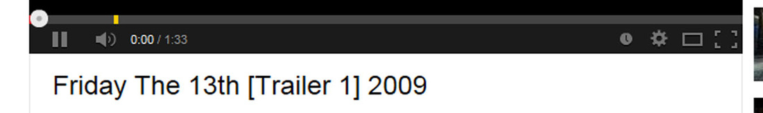
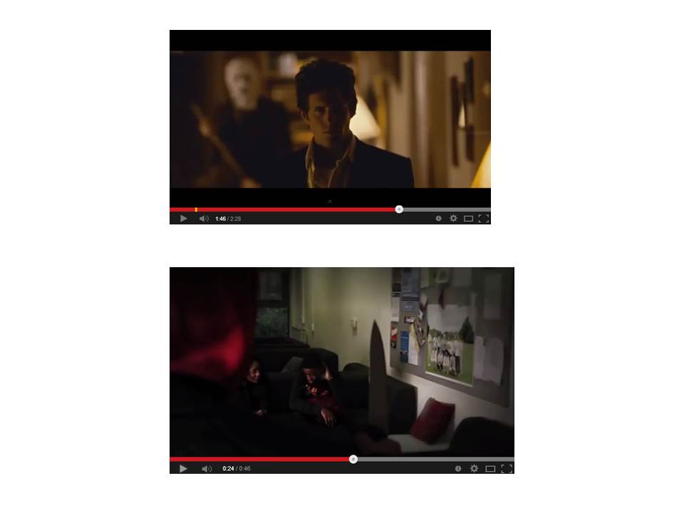
One way of distributing our trailer was through YouTube, which allowed us to advertise our teaser trailer. We used this form of technology as almost all existing trailers use YouTube to advertise their products. As it can be viewed publicly to a mass audience. Making more people aware of it, also giving them an opportunity to like and comment on the trailer. We followed this convention as proliferation of technologies. We also used YouTube to upload our video logs were we spoke about the process of filming our trailer. This is something existing film companies do also. Therefore we had also followed this convention.
Weebly allowed us to follow the conventions of film companies by using website. Using the Weebly website allows us to publish the details of the film such as magazine, poster, trailer and the process of creating these final productions. This is what film companies also to get their media products out there and visible to the public. We decided to use Weebly as it is free for to publish our products, which makes it very convenient for us as a production group.
Facebook was used to promote and distribute our final products. We followed the conventions of using social networking to promote and make our trailer accessible for our consumer. As proliferation in hardware has made marketing products easier for audiences to comment and view our teaser trailer like existing trailers such as: Scream 4 and The strangers. This proves useful for us to track our feedback and for audiences to share our products to others, making our film
|
Overall,I believe that as a production group we have understood the forms and conventions used in media products. As we have understood this we have been able to incorporated the necessary attributes into all of our media products; Magazine, Poster and Trailer. Not only have we been able to follow necessary conventions in our product but we have also challenged and developed conventions in order to get that sense of originality in our products.
